by Jonathan M. Katz. Originally posted at Salon.com.
What caused Haiti’s cholera epidemic? The CDC museum knows but won’t say.
Last Friday, a friend doing research at the U.S. Centers for Disease Control and Prevention in Atlanta sent me a photo of a display at the CDC’s in-house museum. She thought I’d be interested because it had to do with the cholera epidemic in Haiti, which I lived through at its beginning and have been reporting on ever since.
She was right. It blew my mind:
To understand what’s so insane about it, you need to know a little about two of the maps in that image and the CDC’s history with the epidemic.
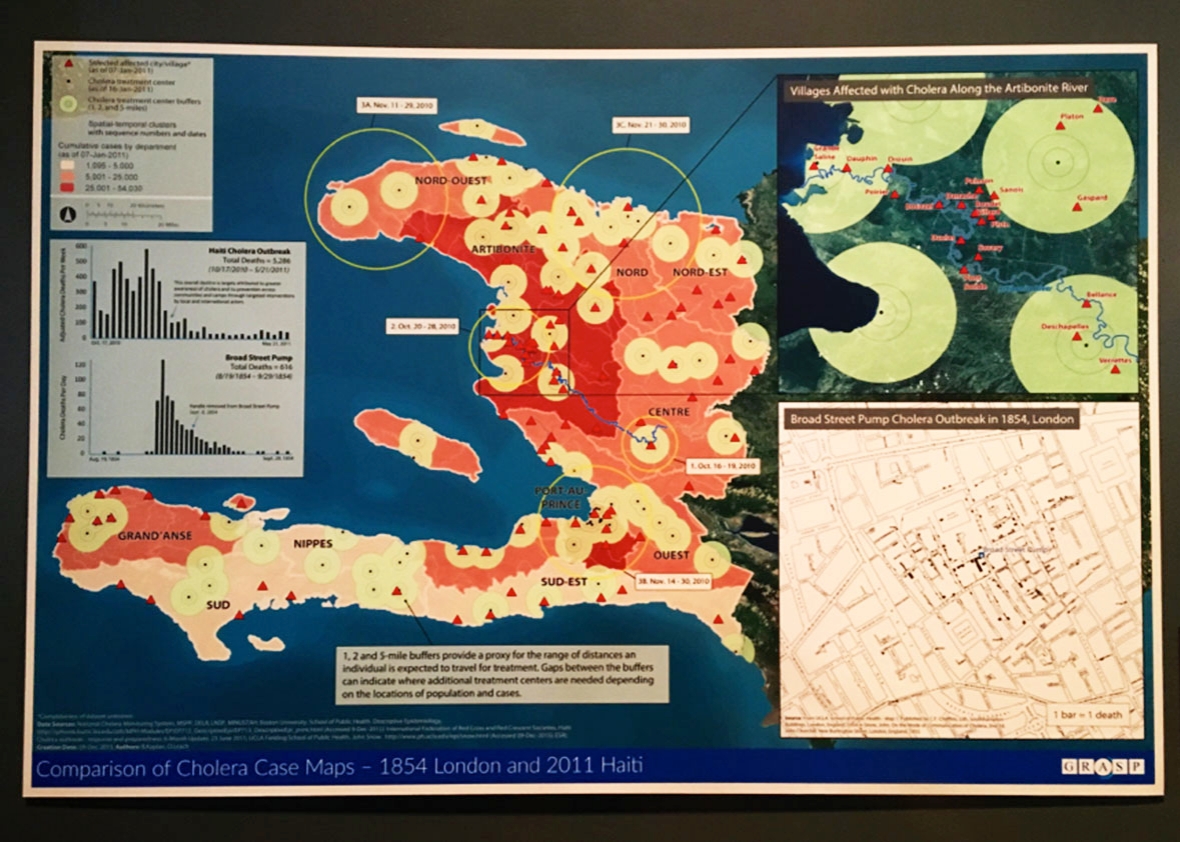
The main part of the map, that pink-and-red mass that looks like a crab claw, is Haiti. Specifically, it is Haiti at the height of the worst cholera epidemic in recent history, an incredible scourge that by official count has killed at least 9,265 people and sickened 775,000 people in that country alone—figures that many experts believe are wild underestimates. Even though this map is just a snapshot from early January 2011, less than three months into an epidemic that has now been raging nearly six years, you’ll note that already not a single part of the country has been left untouched. (The red areas are home to 25,000 cases or more; the pale pink areas, at least 1,000.) By then, the disease had already spread into the neighboring Dominican Republic and would soon be in Cuba, Venezuela, Mexico, and other parts of the region.